Ultragaz App
As a senior product designer, I contributed significantly to the redesign of the Ultragaz app, ensuring a seamless user experience that would support business growth during Black Friday. Our target audience consists primarily of female homemakers who value the convenience and reliability of daily domestic gas service. The journey was characterized by a deep immersion in the customer universe, an iterative design process, and the implementation of solutions that yielded high-impact results.
Context
The cooking gas sector was undergoing accelerated digital transformation, driven by increasing demand for convenience and personalized experiences. Ultragaz, as a market leader and pioneer in Brazil, needed to adapt to this new landscape to maintain its prominent position. Staying aligned with market trends and consumer expectations was crucial to ensuring the project's success.
Strategy
Our strategy was to place the user at the center of all decisions, seeking to deeply understand their needs and pain points. Additionally, we aimed to innovate in how Ultragaz engaged with its customers, using the app as a communication and loyalty channel.
The main objectives of the strategy were:
• Enhance the user experience: simplify the app's navigation, making it easier for customers to find and purchase the desired gas product (LPG, P13) and schedule deliveries.
• Increase conversion rates: streamline the checkout process, reducing friction points and offering secure payment options. Implement features like saved addresses and payment methods to expedite future purchases.
• Strengthen customer relationships: provide real-time order tracking, notifications about delivery status, and a dedicated customer support channel for inquiries and issues related to gas deliveries and payments.
• Boost loyalty: offer exclusive discounts and promotions for app users and personalize recommendations based on past purchase history and location.
Process and Implementation
To thoroughly understand our users' needs and expectations, we conducted in-depth research, including:
• Stakeholder interviews: conducted interviews with a diverse range of stakeholders, including customers, customer service representatives, and marketing professionals. These interviews provided valuable insights into customer demographics, daily routines, app usage patterns, and pain points encountered during the app experience.
• Quantitative and qualitative data analysis: leveraged data analytics tools to analyze extensive app usage data, including user behavior, session duration, and conversion rates. Additionally, conducted thorough analysis of customer satisfaction surveys and app store reviews to identify common themes, positive feedback, and areas for improvement.
• User journey maps: developed visual and user journey maps to visualize the entire customer experience, from initial app discovery to post-purchase interactions. These maps helped identify key touchpoints, potential pain points, and opportunities for optimization.
• Competitor analysis: conducted a thorough analysis of competing apps in the industry, evaluating their user interfaces, features, and overall user experience. This analysis enabled us to identify industry best practices, identify areas where Ultragaz could differentiate itself, and uncover potential competitive advantages.
Through this research, we identified that users sought a more intuitive app with clear and concise information and a simplified purchase process. Users also expressed interest in features like smart ordering, order tracking, delivery scheduling, and personalized promotions
Based on insights from the research phase, we conducted several brainstorming sessions to generate innovative ideas. We used techniques such as design thinking and co-creation dynamics to stimulate creativity and explore different possibilities.
Design guide creation
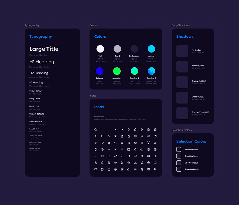
We developed a design guide with reusable components, typography, color palette, and grids, incorporating insights from Ultragaz's official brand guidelines. This ensured visual consistency and streamlined the design process. The color palette, in particular, was carefully chosen in collaboration with Ultragaz's marketing team, aligning with the brand's visual identity and Black Friday campaign.
Alignment with the black friday campaign
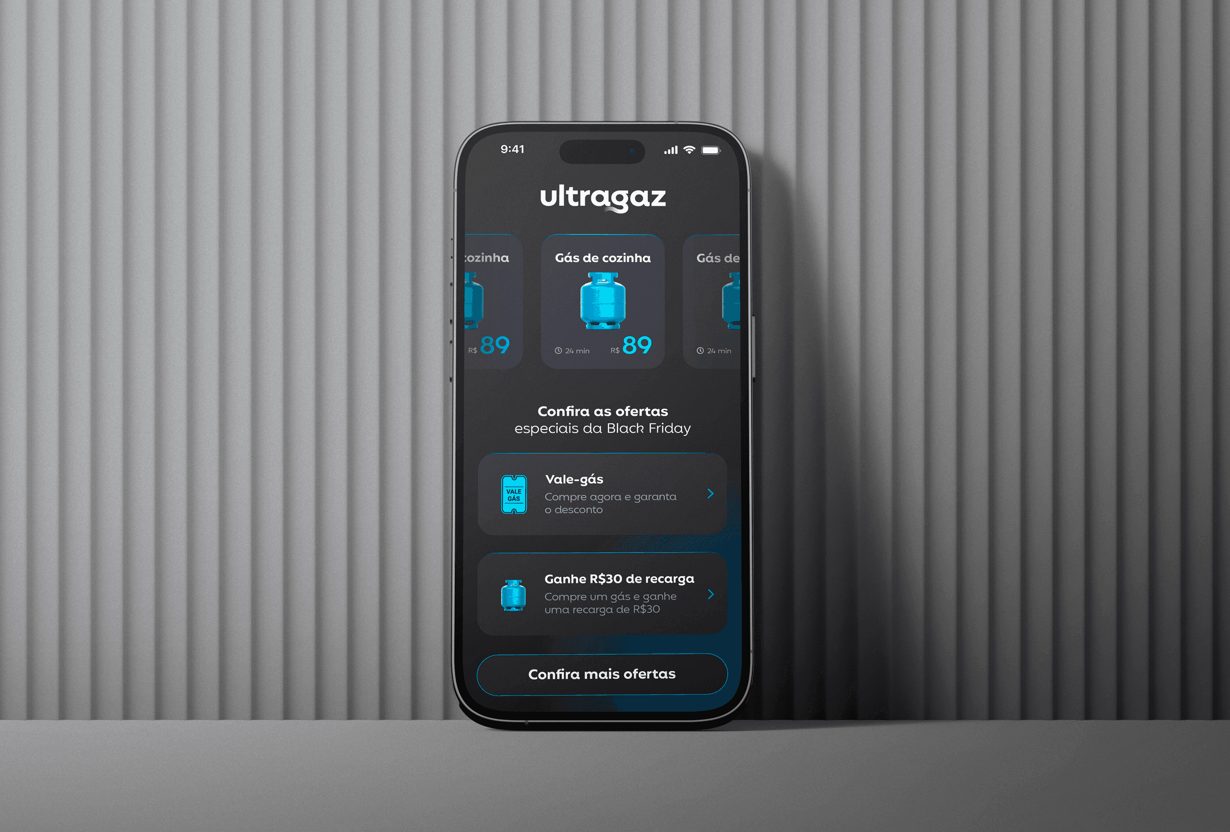
The app screens were carefully designed to convey the energy and appeal of the Black Friday campaign. We used visual elements such as vibrant colors, eye-catching offers, and a dynamic layout to create an engaging shopping experience. The colors defined by Ultragaz for the campaign were strategically applied, ensuring visual cohesion between the app and marketing materials.
To bring our ideas to life, we used Figma as the primary prototyping tool. Figma allowed us to create high-fidelity prototypes, simulating the real user experience. Some best practices we adopted included:
• Reusable components: to streamline the design process and maintain a cohesive visual language, developed a robust component library featuring custom buttons, inputs, and cards. This library not only ensured consistency across the app but also significantly accelerated the design and development phases.
• Interactive prototyping: by leveraging figma's interactive prototyping capabilities, I created highly realistic prototypes that accurately simulated user interactions. These prototypes allowed for early testing and validation of design concepts, ensuring a more intuitive and user-friendly app.
• Accessibility: from the start, we focused on accessibility, ensuring that visual components complied with accessibility guidelines, such as adequate color contrast and alternative text for images.
• Dark mode: we implemented dark mode in the app to meet the growing demand from users and provide a more comfortable visual experience in low-light environments. Additionally, dark mode contributed to battery savings on mobile devices.
Testing and iteration: refining the design
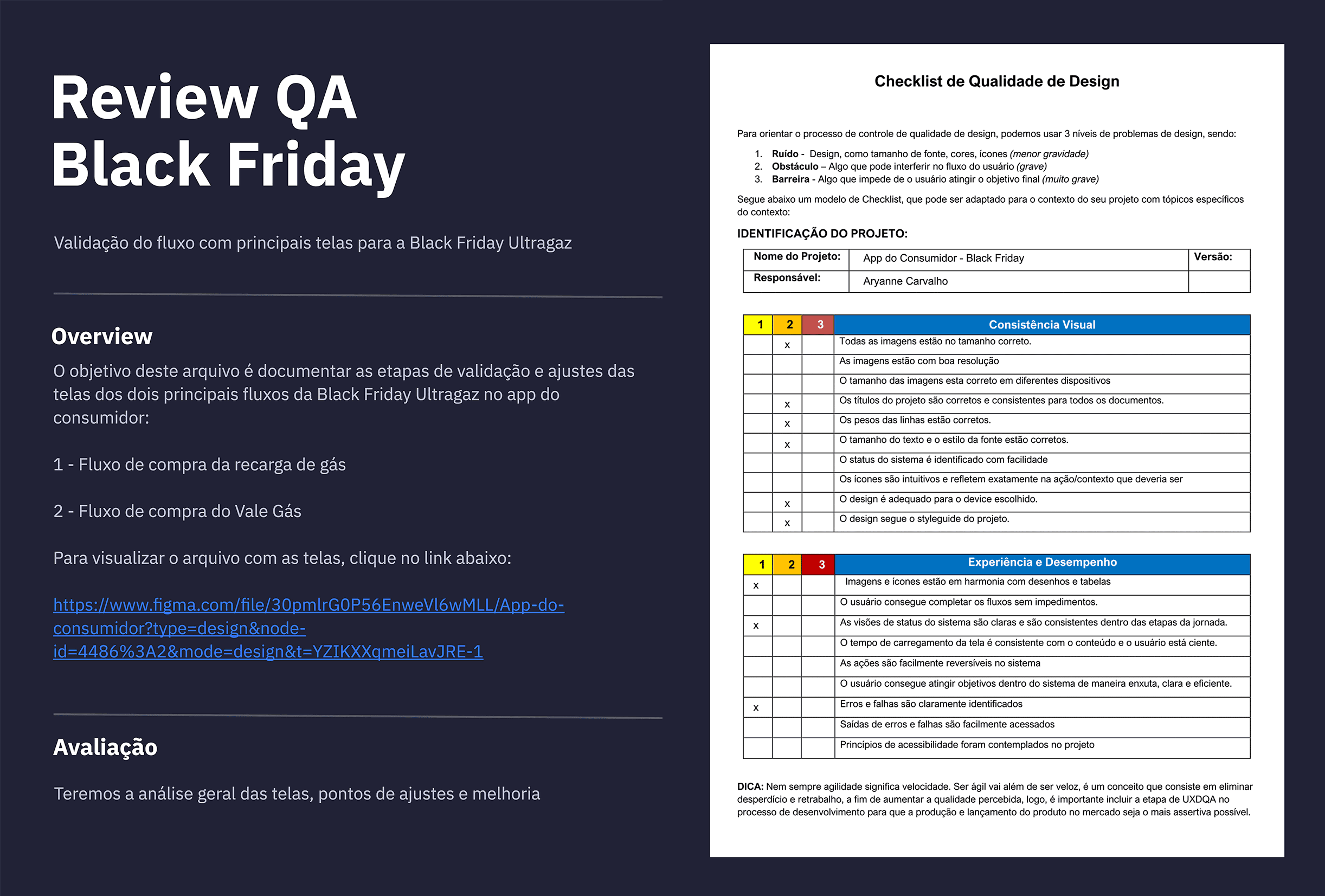
We conducted usability tests with stakeholders to validate our hypotheses and identify improvement opportunities. We assessed ease of use, information comprehension, and overall user satisfaction. Based on Ultragaz feedback, we made several design iterations, adjusting the interface, navigation, and features. This iterative process was crucial in ensuring that the app met users' needs and was easy to use.

In redesigning the Ultragaz app, it was crucial to consider the context in which our customers use the app, often involving people with less familiarity with digital technologies. To ensure an inclusive and effective experience, we adopted the following strategies:
• Clear and objective language: we used simple, direct language, avoiding technical jargon and complex terms. We prioritized clarity in communication, making the app accessible to all users.
• Intuitive interface: the app interface was designed based on intuitive design principles, using clear icons and a well-defined visual hierarchy. This facilitated navigation and understanding of features.
• Usability testing with stakeholders: we conducted usability tests with various stakeholders to identify potential difficulties and adjust the design. This approach ensured the app was intuitive and easy to use for everyone.
• Context of use consideration: we analyzed different contexts in which the app would be used, such as at home, at work, or in areas with low connectivity. We adapted the design to ensure a positive experience in all situations.
• Support and assistance: we implemented an efficient support system, with a comprehensive FAQ and a customer service channel to assist users with any questions.
After finalizing the design, we worked closely with the development team to implement the new features. We used agile methodologies to ensure rapid and efficient development. At this stage, we utilized Azure for documentation, task categorization, and an overview of each team member's contributions.
+292%
New users
+265.4%
Add to cart clicks
80.4
NPS Score
High impact results and relevant points
By contextualizing the digital experience, we created a product that not only met user needs but also adapted to their lifestyle and expectations. By understanding the audience, their pain points, and desires, we were able to offer personalized and relevant solutions.
• Accessibility goals: during the design process, we prioritized accessibility to ensure the app could be used by people with disabilities.
• Personalization: we implemented a personalized recommendation system that suggested products and services based on purchase history and user preferences.
• Integration with other channels: we integrated the app with other Ultragaz service channels to provide a more comprehensive and personalized service.
• Data analysis: we used analytics tools to monitor user behavior and identify opportunities for continuous improvement.
The project results were extremely positive:
• Significant increase in new users and add to cart: the Black Friday campaign, with an optimized purchase flow, resulted in a 292% increase in the number of new users. A 265.4% increase in "add to cart" clicks.
• Improved net promoter score (NPS): the app’s NPS reached 80.4, demonstrating a high level of customer satisfaction.
• Increased conversion rate: the conversion rate, or the percentage of users making a purchase, increased significantly.
• Positive user feedback: users highlighted ease of use, intuitive interface, and app personalization.
Through a meticulous design process that prioritized user feedback and iterative improvements, the Ultragaz app was transformed into a powerful tool for driving business growth. By placing the user at the heart of every decision, I was able to create a product that not only enhanced the customer experience but also solidified Ultragaz's position as a market leader.


